- EGroupware
- Layout
- Which layout do I want?
- Put your widgets directly in the container
- The layouts
- stack
- 2-column
- edit
- What it looks like as the container narrows
- Wide: two columns
- Narrower: one column
- Narrowest: labels wrap above
- Who changed it, and when
- Wider widgets: span
- Taller widgets: grow
- Sharing the space between several widgets
- Setting limits
- Lining up labels
- CSS Variables
- –column-min-width
- –collapse-width
- Popups inside a layout
- Fitting a popup to a layout
- Widget Implementation
- Adding layout support to a widget
- Where the CSS lives
- Span and grow sizing
- 2-column / edit responsive behavior
- Used by
- Methods
Layout Controller
Et2LayoutController
Layout
Templates and dialogs used to be arranged with a <grid>: you counted the columns, you
counted the rows, and what you got was what everybody got, no matter how much room they actually had on
screen.
Layouts replace that. You add one attribute to the container, put your widgets inside it, and the layout arranges them - and re-arranges them when the popup, the window or the panel it lives in changes size.
<et2-template id="myapp.edit" layout="edit">
	<et2-textbox id="name" label="Name"/>
	<et2-select id="status" label="Status"/>
	<et2-date id="due" label="Due"/>
	<et2-select-cat id="cat_id" label="Category"/>
</et2-template>
That is the whole thing. No columns, no rows, no <grid>. Four widgets, two per line while
there is room for two, one per line when there is not - and three per line if the dialog is wide enough for
three.
Layout is opt-in and there is no default: a template without a layout attribute lays out
exactly as it always has. You can convert one dialog without touching any of the others.
layout, and the span, grow and full attributes below,
are all declared in etemplate2.0.dtd / etemplate2.0.rng, so a validating editor
accepts them in a .xet file. They are also declared as reflecting properties on
Et2Widget, which is what actually puts them on the element: the layout CSS matches
[grow] / [span="all"] / [full], and
transformAttributes() only writes an attribute for a property the widget declares as reflecting
- anything else it sets as a plain JS property, where no selector can see it.
Which layout do I want?
layout |
Use it for |
|---|---|
stack |
A list of widgets, one per line. Simple views, sidebars, a tab panel with a few fields. |
2-column |
Fields side by side - as many columns as the container can hold, collapsing to one when it cannot. |
edit |
2-column, plus the conventions an edit dialog wants: full-width header & footer,
roomy tabbox.
|
Put your widgets directly in the container
The layout arranges the container’s direct children. Do not wrap them in a
<grid>, a <table> or one big <et2-box> “to hold
everything” - the layout would then have exactly one child to arrange, and nothing would happen.
<!-- No.  The layout sees one child (the grid) and has nothing to arrange. -->
<et2-template id="myapp.edit" layout="2-column">
	<grid>
		<columns>
			<column/>
			<column/>
		</columns>
		<rows>
			<row>
				<et2-textbox id="name" label="Name"/>
				<et2-select id="status" label="Status"/>
			</row>
		</rows>
	</grid>
</et2-template>
<!-- Yes.  The layout sees two children and puts them side by side. -->
<et2-template id="myapp.edit" layout="2-column">
	<et2-textbox id="name" label="Name"/>
	<et2-select id="status" label="Status"/>
</et2-template>
Grouping boxes are still fine where they mean something - an <et2-hbox> holding a field
and its unit belongs together, and it counts as one child of the layout. What you want to avoid is a wrapper
whose only job is to be a container, because that is the job you just handed to the layout.
The layouts
stack
One widget per line, in the order you wrote them. Each keeps its natural height, except for children marked
grow, which share out whatever vertical space is left over.
<et2-template id="myapp.view" layout="stack" style="height: 14em">
    <et2-textbox id="title" label="Title"></et2-textbox>
    <et2-select id="status" label="Status"></et2-select>
    <et2-textarea id="notes" label="Notes" grow="1"></et2-textarea>
</et2-template>
The height is there only so that there is leftover space for grow to take - a real template
gets its height from whatever it is sitting in. Title and Status keep their own; Notes takes the rest.
This is also the default for <et2-customfields>, so a tab full of customfields reads one
field per row unless you ask for something else.
2-column
As many columns as the container can fit at
--column-min-width each, and one when it cannot fit two. Two is
the usual answer and what the name is about, but a wide enough container gets three. Widgets flow left to
right, top to bottom, and you can let one span both columns or
grow vertically.
<et2-template id="myapp.details" layout="2-column"
              style="max-width: 44em; --column-min-width: 18em">
    <et2-date id="start" label="Start"></et2-date>
    <et2-date id="end" label="End"></et2-date>
    <et2-textbox id="location" label="Location"></et2-textbox>
    <et2-select id="owner" label="Owner"></et2-select>
    <et2-textarea id="description" label="Description" span="all"></et2-textarea>
</et2-template>
Nothing in that markup asks for the labels to line up - a layout does it for you, see Lining up labels.
The number of columns is decided by the container, not by the window, so the same template can be two columns in a wide popup and one column in a narrow sidebar without knowing anything about either.
edit
2-column with the extras an edit dialog wants:
-
Anything whose class contains
headerorfooter(dialogHeader,dialogFooter,editHeader, …) is automatically full width, so the title bar and the button row stretch across both columns. -
<et2-tabbox>is full width and at least20emtall, so the tabs are not squeezed into half a dialog. <et2-nextmatch>is full width too, for the same reason.<et2-appicon>does not stretch.-
A
footerstays at the bottom of the dialog while the form scrolls, so Save / Apply / Cancel stay reachable, and its widgets wrap onto another line rather than run off the edge of a narrow panel. -
When the container is as narrow as it takes to stack the labels above the fields (
36em), everyet2-buttonwith an icon gives up its label and keeps only the icon. Above that there is room for both, so both stay. The label is clipped, not removed, so it is still the button’s accessible name. A button without an icon keeps its label, and so doeset2-dropdown-button. -
Anything with the class
dialogMetais a row of read-only facts - see Who changed it, and when.
<et2-template id="timesheet.edit" layout="edit">
	<et2-hbox class="dialogHeader">
		<et2-textbox id="ts_title" label="Title" class="et2-label-fixed"/>
		<et2-appicon src="timesheet"/>
	</et2-hbox>

	<et2-date id="ts_start" label="Date"/>
	<et2-date-timeonly id="start_time" label="Starttime"/>
	<et2-date-duration id="ts_duration" label="Duration"/>
	<et2-date-timeonly id="end_time" label="or endtime"/>

	<et2-tabbox id="tabs">
		...
	</et2-tabbox>
</et2-template>
(This is timesheet/templates/default/edit.xet, trimmed - it is the dialog in the screenshots
below.)
What it looks like as the container narrows
The same dialog, at three widths. Nothing in the template changes between these - only the space it was given.
Wide: two columns
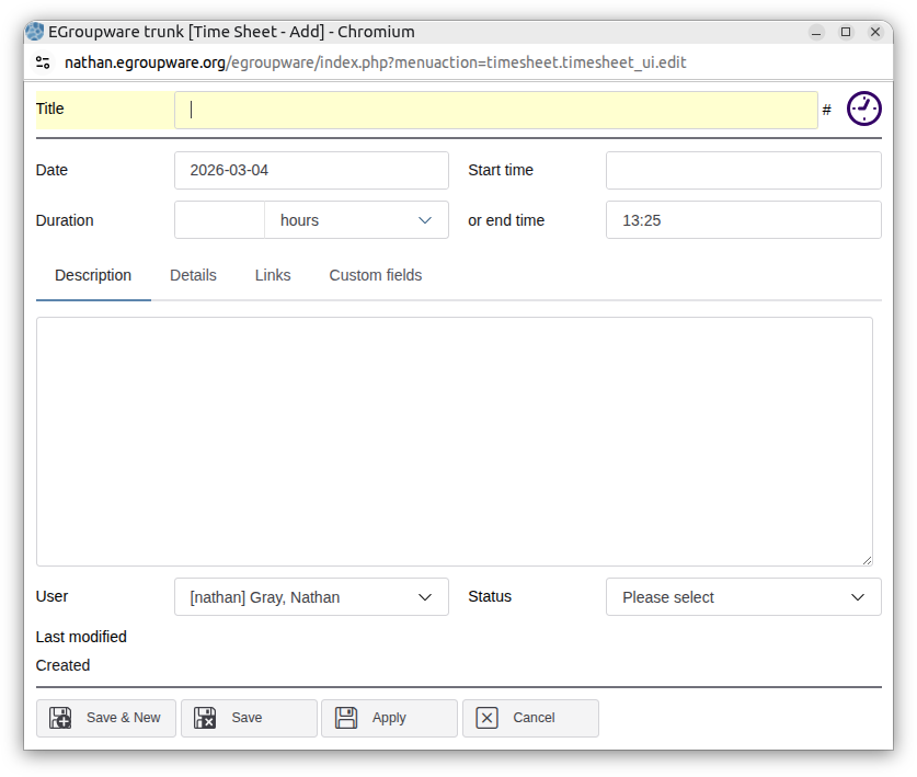
Label beside its input, two fields per line. The title row and the tabbox span both columns.
Narrower: one column
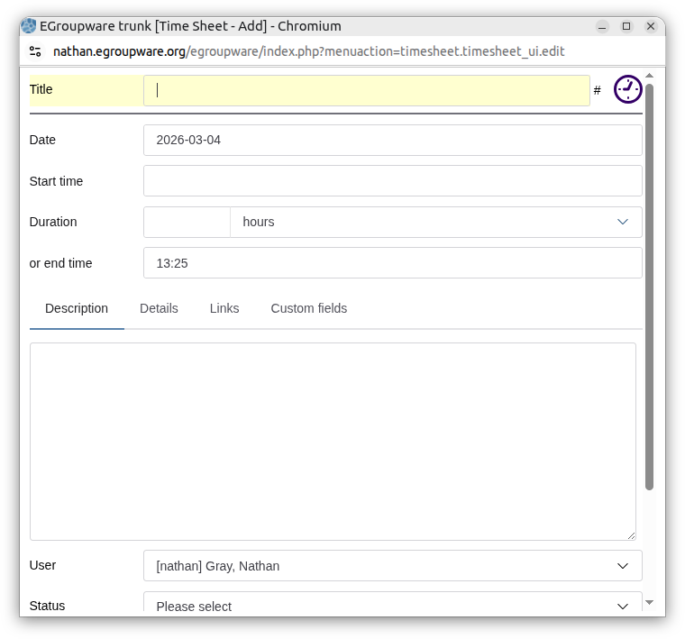
Once a second column would be too narrow to be useful, the grid drops to one. Labels are still beside their inputs.
Narrowest: labels wrap above
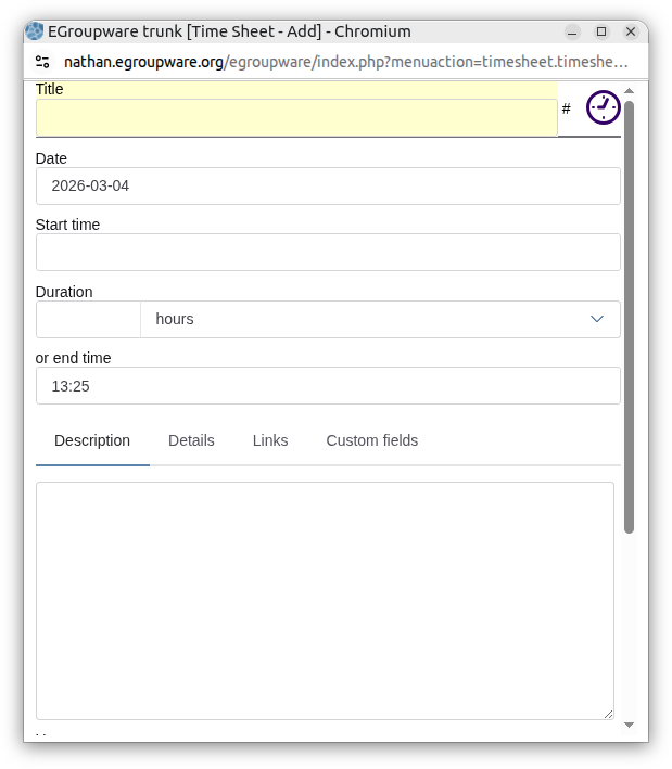
When even one column cannot hold a label and an input side by side, the labels move above the inputs - and they do it for every field at once, so the form does not turn into a ragged mix of wrapped and unwrapped rows.
Who changed it, and when
The owner, the last modifier and the dates are not inputs, so they do not line up with the form’s fields by
themselves. Give a row of them the class dialogMeta, and edit sets it out like one
more field: a label in the label column, then the name starting where the inputs above it start, and the
date at the edge of the cell.
<et2-hbox class="dialogMeta">
	<et2-description value="Last modified" for="ts_modifier"/>
	<et2-hbox>
		<et2-select-account id="ts_modifier" readonly="true"/>
		<et2-date-time id="ts_modified" readonly="true"/>
	</et2-hbox>
</et2-hbox>
<et2-hbox class="dialogMeta">
	<et2-description value="Created" for="ts_created"/>
	<et2-date-time id="ts_created" readonly="true"/>
</et2-hbox>
- The label and the pair that follows it are separate children, so the pair can wrap by itself. When the cell is too narrow for the name and the date together, the date drops to a line of its own and, being alone on it, starts under the name rather than under the label.
-
A row with nothing but a date (
Created) has the date at the right edge, so stacked in one column the dates end at the same place whatever the names before them. - At the width where the labels stack above their fields, the name and date drop under their label too.
Wider widgets: span
In 2-column and edit, a widget takes one column by default.
span changes that:
| Attribute | Effect |
|---|---|
span="all" (or full="true") |
Full width - the widget takes every column, wherever it is. |
span="end" / span="*" |
Stretch from the column the widget landed in to the end of its line. |
span="all" means the same thing it did in a legacy <grid>, so it usually
survives a conversion unchanged.
<et2-template id="span-demo" layout="2-column"
              style="max-width: 44em; --column-min-width: 18em">
    <!-- one column each, side by side -->
    <et2-date id="start" label="Start"></et2-date>
    <et2-date id="end" label="End"></et2-date>

    <!-- the full width of the dialog -->
    <et2-textarea id="description" label="Description" span="all"></et2-textarea>

    <!-- Reference takes the first column, so span="end" leaves Private the second one -->
    <et2-textbox id="reference" label="Reference"></et2-textbox>
    <et2-checkbox id="private" label="Private" span="end"></et2-checkbox>

    <!-- nothing beside this one, so span="end" gives it the whole line -->
    <et2-textbox id="note" label="Note" span="end"></et2-textbox>
</et2-template>
Both of the last two say span="end" and they come out different widths, because
end is relative to where the widget was placed: Private was put in the second
column and had one column left to take, Note started a line of its own and took all of it.
full needs a real value, because it resolves through the array manager the way every other
boolean attribute does - which is also what lets you write full="@is_wide". A bare
full="" is false, not “present”.
<et2-tabbox> and <et2-nextmatch> are always full width in these
layouts - you do not have to say span="all" on either of them. Half a dialog is not a useful
width for a tab panel or a list.
span only means something to 2-column and edit.
stack gives every child the full width anyway.
Taller widgets: grow
By default every widget is as tall as it needs to be, and any space left at the bottom of the container
stays empty. grow marks the widgets that should take that space instead:
<et2-template id="myapp.view" layout="stack">
	<et2-textbox id="title" label="Title"/>
	<!-- fills the rest of the panel, however tall it is -->
	<et2-textarea id="notes" label="Notes" grow="1"/>
</et2-template>
<et2-tabbox> and <et2-nextmatch> grow on their own - they are the
usual “everything else is a header, the list gets the rest” case, and needing an attribute for them every
time would just be noise.
Sharing the space between several widgets
Give grow a number to say how that space is divided between them. The numbers are proportions:
a grow="2" widget ends up twice as tall as a grow="1" one.
<et2-template id="grow-demo" layout="stack" style="height: 18em">
    <et2-textbox id="title" label="Title"></et2-textbox>
    <et2-textarea id="description" label="Description" grow="1"></et2-textarea>
    <et2-textarea id="notes" label="Notes" grow="2"></et2-textarea>
</et2-template>
grow on its own (or grow="1") is the same as a factor of 1. Factors work the same
way in all three layouts.
A growing widget’s own height stops counting once it is growing - the factors divide the whole of the space
the non-growing widgets did not take, not just what is left over after each grower’s natural height. Without
that, grow="2" would do nothing at all for a widget like <et2-textarea> that
is already tall enough to fill its container: there would be no leftover to divide, and the layout would be
shrinking the widgets rather than growing them.
Setting limits
A growing widget’s own min-height and max-height are respected: the layout uses
them as the floor and ceiling for the line it is on. This is the way to say “grow, but never smaller than
this” without giving it a fixed height.
et2-template[layout="edit"] #notes {
	min-height: 8em;
	max-height: 30em;
}
If several growing widgets share a line, the tallest min-height and the smallest
max-height win.
Lining up labels
A layout gives its fields a fixed label width, so the inputs all start at the same place instead of wherever
each label happens to end. Nothing has to ask for it: a layout is a form, and a form wants its labels in a
column, so the layout puts the et2-label-fixed class on its children itself. Set
--label-width to change how much room they get, and see
Fixed width labels for what the class does on one
widget.
When the container is too narrow to hold a fixed label beside its input, the layout moves the labels above instead - all of them at once, as in the third screenshot above.
The container’s class is the whole statement about this:
| Container | Labels |
|---|---|
<et2-template layout="edit"> |
lined up |
<et2-template layout="edit" class=""> |
left alone |
<et2-template layout="edit" class="myapp-edit"> |
left alone |
<et2-template layout="edit" class="... et2-label-fixed"> |
lined up |
Left alone is what a form with long labels wants, because --label-width is then a narrow column
for a sentence to wrap inside and the row grows half again as tall as it needs to be. Configuration screens
are the usual case.
A class added only for styling turns the lined-up labels off as a side effect. If a converted dialog’s
labels stop lining up, look at the container’s class first.
et2-label-fixed on an individual widget works either way, so a form can leave the labels alone
and still line up the few fields whose labels are short enough.
CSS Variables
--column-min-width
- Default:
26rem -
The narrowest a column is allowed to get in
2-columnandedit. Set it wider for a form with long labels or wide inputs, and the grid will stay one column for longer.
et2-template[layout="edit"] {
	--column-min-width: 24rem;
}
It can also be set per template, right where the layout is chosen:
<et2-template id="timesheet.edit.general" layout="2-column" style="--column-min-width:34em;">
Choose a value that lets a column hold a label and its input side by side: the label
column (--label-width, 8em by default) plus the widest input in the form.
24em holds a date input, as in the timesheet dialog; link entries, category selects and email
inputs need more - 28em in the InfoLog dialog.
The value scales with the text size, but the inputs do not scale in step with it exactly, so check a new dialog with the “Set content size” preference at its largest. A column that is too narrow does not overflow - the label is the part that gives way, so some labels come out narrower than the others and the inputs stop lining up. If that happens, widen the column.
--collapse-width
- Default:
600px - Intended as an explicit “collapse to one column below this width” override.
Not effective yet. --collapse-width is only read inside a @container query
condition, and browsers cannot evaluate var() there today. The live collapse point is a
hardcoded 600px container query plus the auto-fit sizing driven by
--column-min-width. The var() versions are deliberately left in the stylesheet
so they start working when browsers catch up - please do not “fix” them by removing them.
Popups inside a layout
2-column and edit make their host a container query container so the grid can
decide for itself when to collapse. et2-customfields does the same regardless of its layout.
That breaks any hoisted Shoelace popup opened inside them: Floating UI reads a
container-type ancestor as the containing block for the popup’s position: fixed,
no browser does (checked on Chrome 152 and Firefox 142), and the dropdown ends up
scrollTop - containerTop away from its field and clamped to the height of the panel it sits in.
Et2TopLayerPopupController, created alongside Et2LayoutController, moves those
popups into the top layer while they are open, where both agree the coordinates are viewport coordinates.
Nothing has to be done per widget, and the container itself is untouched - giving it real containment (contain: layout) would fix the dropdowns and break everything else that escapes a scrolling panel with
position: fixed, including the rich text editor’s menus.
Fitting a popup to a layout
A popup is sized to its content: resize_popup() in egw.js compares the window with
the container and moves the window by the difference. A layout fills whatever it is given and scrolls inside
it, so the container never says how big the content is, and without help a popup holding a layout would stay
at the size it was opened at.
getPreferredSize() on <et2-template> says it instead - it asks its
Et2LayoutController, which does the measuring. It returns the size of the layout’s content box,
in pixels, or null when there is no layout to measure:
-
Width: the layout’s preferred number of columns (
2for2-columnandedit,1forstack), each--column-min-widthwide, plus the gaps, the padding and room for a scrollbar. The width is never below--collapse-widthplus the scrollbar, or the columns it asked for would collapse again. - Height: every row at its natural height at that width, with a growing row such as a tabbox at its own minimum.
resize_popup() moves the window by how far the layout is from that size, never beyond what the
screen has room for, and it shrinks a window that is bigger than the layout needs. Nothing has to be done in
the template.
The size a popup is registered with (edit_popup and friends in the app’s hooks) is
only the size it opens at. Register one that fits the layout’s preferred size at the standard text size, so
the popup does not open in one column and then jump. The registered size is in pixels and does not follow
the “Set content size” preference, which is why the popup is fitted afterwards.
A window that is already as tall as the screen keeps its height - resize_popup() has always
left those alone.
Widget Implementation
Et2LayoutController applies layout strategies (stack, 2-column,
edit) to layout hosts, and keeps spanned columns and grow rows sized correctly as content
resizes.
Adding layout support to a widget
A widget that wants layout behaviour implements Et2LayoutHost and instantiates the controller.
The layout property must reflect - the layout CSS matches the [layout] attribute,
not a class - and it must not have a default, or every instance of that widget in every app suddenly gets a
layout it never asked for.
import {Et2LayoutController, Et2LayoutHost, Et2LayoutName} from "../Layout/Et2LayoutController/Et2LayoutController";

export class MyLayoutHost extends Et2Widget(LitElement) implements Et2LayoutHost
{
	@property({reflect: true})
	layout : Et2LayoutName;

	private _layout = new Et2LayoutController(this);
}
A widget that should be able to say how big its layout would like to be (see Fitting a popup to a layout) forwards to the controller:
getPreferredSize() : Et2LayoutSize | null
{
	return this._layout.getPreferredSize();
}
The widget also needs an element with part="base" wrapping its children - that is what the
layout CSS turns into a grid or a flexbox, and what the controller writes row sizing onto.
Et2Template additionally puts a layout-<name> class on it, for anything that
wants to match on the layout without going through ::part().
At each lifecycle update the controller:
- Looks up the strategy from
layout - Cleans up the previous strategy (if it changed)
- Applies the active strategy to the current children
Where the CSS lives
Most of the layout behaviour is CSS, in kdots/css/src/layouts/*.less, not in the widget’s
static styles:
| File | What it holds |
|---|---|
grid-base.less |
The shared column grid mixin, used by 2-column and edit |
stack.less |
Flex column |
2-column.less |
.layout-grid-base([layout="2-column"]) |
edit.less |
The same, plus the edit-dialog rules |
index.less |
Imports the above; pulled into kdots.less |
This is bad for encapsulation and good for control: the rules have to reach both shadow-DOM hosts (via
::part(base)) and light-DOM hosts like et2-customfields (via
> [part~="base"], an ordinary attribute selector, because ::part() cannot cross
a boundary that is not there). A static styles block inside one widget could not do both.
Span and grow sizing
Et2LayoutStrategies.ts handles the runtime part - the two things CSS alone cannot work out:
where the grid actually put each child, and what number grow was given.
On apply, the strategy registers a ResizeObserver on the host. On every resize it schedules a
requestAnimationFrame (cancelling any already pending), and what it does in that frame depends
on what the layout CSS made of ::part(base).
If the base is a flex container - that is stack - flex distributes the leftover height itself,
so the only thing to do is read each grow child’s factor out of the attribute and set it as an inline
flex-grow; the stylesheet can only say flex: 1 1 auto, which would give every
growing child an equal share. That is the whole pass, and it returns there: everything below writes grid
properties a flex container ignores.
For a grid base (2-column, edit) it:
-
Stretches every
span="end"/span="*"child to the end of its line. A browser does not expose the column auto-placement chose - the computedgrid-column-startof an auto-placed item is stillauto- so the column is worked out from the used track sizes and the child’s distance from the grid’s inline-start content edge, then written back as an explicitgrid-column: <column> / -1. This happens first because widening one child can push the ones after it onto a different line, which would invalidate every measurement below. Children are handled in document order and measured one at a time for the same reason. - Measures the
topof every visible child and groups them into lines (1px tolerance) -
Finds which line each
[grow]/<et2-tabbox>/<et2-nextmatch>child landed on, and reads its computedmin-height/max-heightand grow factor -
Writes a
grid-template-rowstrack list onto::part(base):min-contentfor lines with nothing growing,minmax(<min>, <factor>fr)for the ones that do - Sets
align-content: stretchso those tracks actually take the extra space
With no growing child it removes both properties again, and cleanup() disconnects the observer,
cancels any pending frame and clears every inline style it set - the spanned children’s
grid-column and the grown children’s flex-grow, either of which would otherwise
survive into whatever layout comes next.
2-column / edit responsive behavior
The base grid in grid-base.less uses:
grid-template-columns: repeat(auto-fit, minmax(var(--column-min-width, 26rem), 1fr));
auto-fit is what makes this responsive without a media query: the grid takes as many whole
columns as fit and drops to one before any of them would go under --column-min-width. With the
26rem default that is two columns from about 850px and three from about 1290px. The host is
container-type: inline-size, so that decision is made against the container, not the viewport.
In one-column mode, label/input parts are normalized together so widgets do not wrap inconsistently per-field:
-
::part(form-control-label)->width: 100%,flex-basis: 100%,margin-right: 0 ::part(form-control-input)->flex-basis: 100%::part(form-control-help-text)->left: 0-
.et2-label-fixed::part(form-control)->flex-wrap: wrap(it isnowrapotherwise)
Those overrides are specificity-sensitive: the one-column rules have to stay at least as specific as the
wide-mode nowrap rule they undo, or the labels silently never wrap.
Used by
These widgets create and host this controller.
Methods
| Name | Description | Arguments |
|---|---|---|
getPreferredSize()
|
How big this layout would like to be, for a window sized to its content (a popup). The host fills whatever it is given and scrolls inside it, so anything measuring it only ever gets back the size it already has - which is why a popup holding a layout cannot fit itself to it the way it fits a template made of a fixed table. This is the size the layout asks for instead: the columns it prefers, each as wide as –column-min-width, and every row at its natural height (a growing row at its own minimum) once the columns are that wide. Measured in place, in one go: the host is given the preferred width and no height, read, and put back before the browser paints. |
columns: number
|