Template
<et2-template> | Et2Template
Load & populate a template (.xet file) into the DOM
The template displays a loader while it is loading the file, and is replaced with the actual content once all widgets are ready.
<style>
    et2-template {
        min-height: 5em;
    }
</style>
<et2-template template="template"></et2-template>
Loading
Since template files are auto-fetched from the server, actual examples here would not work.
Template
Use template attribute with <app>.<template> format to specify which
template to load.
This will fetch /<app>/templates/<interface>/<template>.xet, where
<interface> is the user’s current interface, or default.
<et2-template template="infolog.edit"></et2-template>
Sub-templates
If the template file contains more than one template definition, you can load any of the other templates defined after the file has been loaded using either their full ID or a shortened form. This is useful for breaking a template into smaller parts.
multiple.xml:
<overlay>
    <template id="multiple.one" class="one">...</template>
    <template id="multiple.two" class="two">...</template>
    <template id="multiple" class="multiple">
        ...
        <et2-template template="multiple.one"></et2-template>
        ...
        <et2-template template="two"></et2-template>
    </template>
</overlay>
URL
If you need to bypass the autoloading based on template ID, you can specify the full URL to the template
file. If there are multiple templates defined in the file and you did not specify template, the
last template in the file will be loaded.
Content
When loading Et2Template will use its array managers (content, select_options, readonlys &
modification) to set the child widget attributes as it loads them.
Use content to create a namespace, loading the template using only a sub-section of the content
arrays.
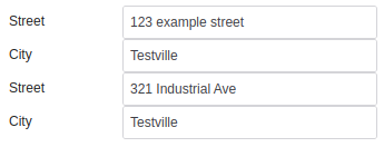
Content data:
{
  "address_one": {
    "street": "123 example street",
    "city": "Testville"
  },
  "address_two": {
    "street": "321 Industrial Ave",
    "city": "Testville"
  }
}
client/default/view.xet:
<overlay>
    <template id="address">
        <et2-textbox id="street" label="Street"></et2-textbox>
        <et2-textbox id="city" label="City"></et2-textbox>
        ...
    </template>
    <template id="client.view">
        ...
        <et2-template template="address" content="address_one"></et2-template>
        <et2-template template="address" content="address_two"></et2-template>
        ...
    </template>
</overlay>
Result:
Slots
| Name | Description |
|---|---|
| (default) | The template’s contents |
loader
|
Displayed while the template contents are being loaded instead of the built-in loader |
Learn more about using slots.
Properties
| Name | Description | Reflects | Type | Default |
|---|---|---|---|---|
accesskey
|
Accesskey provides a hint for generating a keyboard shortcut for the current element. The attribute value must consist of a single printable character. |
|
string
|
- |
actions
|
Set Actions on the widget Each action is defined as an object: move: { type: “drop”, acceptedTypes: “mail”, icon: “move”, caption: “Move to” onExecute: javascript:mail_move” } This will turn the widget into a drop target for “mail” drag types. When “mail” drag types are dropped, the global function mail_move(egwAction action, egwActionObject sender) will be called. The ID of the dragged “mail” will be in sender.id, some information about the sender will be in sender.context. The etemplate2 widget involved can typically be found in action.parent.data.widget, so your handler can operate in the widget context easily. The location varies depending on your action though. It might be action.parent.parent.data.widget To customise how the actions are handled for a particular widget, override _link_actions(). It handles the more widget-specific parts. |
object
|
- | |
align
|
Used by Et2Box to determine alignment. Allowed values are left, right |
|
string
|
- |
class
|
CSS Class. This class is applied to the outside, on the web component itself. Due to how WebComponents work, this might not change anything inside the component. |
|
string
|
- |
content
|
Used as index into content array for passing in specific content to the template other than what it would get by its ID |
string
|
- | |
data
|
Set the dataset from a CSV |
string
|
- | |
deferredProperties
|
Any attribute that refers to row content cannot be resolved immediately, but some like booleans cannot stay a string because it’s a boolean attribute. We store them for later, and parse when they’re fully in their row. If you are creating a widget that can go in a nextmatch row, and it has boolean attributes that can change for each row, add those attributes into deferredProperties | - | - | |
disabled
|
Defines whether this widget is visibly disabled. The widget is still visible, but clearly cannot be interacted with. Widgets disabled in the template will not return a value to the application code, even if re-enabled via javascript before submitting. To allow a disabled widget to be re-enabled and return a value, disable via javascript in the app’s et2_ready() instead of an attribute in the template file. |
|
boolean
|
false
|
dom_id
|
Get the actual DOM ID, which has been prefixed to make sure it’s unique. |
string
|
- | |
hidden
|
The widget is not visible. As far as the user is concerned, the widget does not exist. Widgets hidden with an attribute in the template may not be created in the DOM, and will not return a value. Widgets can be hidden after creation, and they may return a value if hidden this way. |
|
boolean
|
- |
id
|
Get the ID of the widget |
string
|
- | |
label
|
The label of the widget This is usually displayed in some way. It’s also important for accessability. This is defined in the parent somewhere, and re-defining it causes labels to disappear |
string
|
- | |
noLang
|
Disable any translations for the widget |
boolean
|
- | |
parentId
|
Parent is different than what is specified in the template / hierarchy. Widget ID of another node to insert this node into instead of the normal location |
string
|
- | |
statustext
|
Tooltip which is shown for this element on hover |
|
string
|
- |
styles
|
WebComponent * | - | - | |
template
|
Name / ID of template. It can be full [app].[template_file].[template] form or just the last part. Templates will be loaded from /[app]/templates/interface/[template_file].xet To use the short form, the file must already be loaded. |
string
|
- | |
templateCache
|
Cache of known templates |
{[name : string] : Element}
|
{}
|
|
url
|
A full URL to load template, optionally including cache-buster (‘?’+filemtime of template on server) |
string
|
- | |
options
|
Get property-values as object
use widget methods |
object
|
- | |
supportedWidgetClasses
|
et2_widget compatability
Legacy compatability. Some legacy widgets check their parent to see whats allowed |
array
|
[]
|
|
updateComplete |
A read-only promise that resolves when the component has finished updating. |
Learn more about attributes and properties.
Events
| Name | React Event | Description | Event Detail |
|---|---|---|---|
load |
Emitted when all elements are loaded |
CustomEvent
|
Learn more about events.
Methods
| Name | Description | Arguments |
|---|---|---|
checkCreateNamespace()
|
Override parent to support content attribute Templates always have ID set, but seldom do we want them to create a namespace based on their ID. | - |
clone()
|
Creates a copy of this widget. |
_parent: et2_widget
|
createElementFromNode()
|
Create a et2_widget from an XML node. First the type and attributes are read from the node. Then the readonly & modifications arrays are checked for changes specific to the loaded data. Then the appropriate constructor is called. After the constructor returns, the widget has a chance to further initialize itself from the XML node when the widget’s loadFromXML() method is called with the node. |
_node: , _name:
|
findTemplate()
|
Find the template XML node, either from the local cache or the server | - |
getArrayMgr()
|
Returns the array manager object for the given part |
managed_array_type: string
|
getArrayMgrs()
|
Returns an associative array containing the top-most array managers. |
_mgrs: object
|
getChildren()
|
Get child widgets Use |
- |
getDOMWidgetById()
|
Searches for a DOM widget by id in the tree, descending into the child levels. |
_id:
|
getInputWidgetById()
|
Searches for a Value widget by id in the tree, descending into the child levels. |
_id:
|
getInstanceManager()
|
Returns the instance manager | - |
getPath()
|
Returns the path into the data array. By default, array manager takes care of this, but some extensions need to override this | - |
getRoot()
|
Returns the base widget Usually this is the same as getInstanceManager().widgetContainer | - |
getValueById()
|
Get the current value of a child widget, specified by the given ID This is the current value of the widget, which may be different from the original value given in content |
id: string
|
load()
|
Get the template XML and create widgets from it Asks the server if we don’t have that template on the client yet, then takes the template node and goes through it, creating widgets. This is normally called automatically when the template is added to the DOM, but if you want to re-load or not put it in the DOM you need to call load() yourself. |
                      newContent: object, newSelectOptions: { [widgetID : string] : SelectOption[] }, newReadonlys: {
                      [widgetID : string] : string | boolean | object }, newModifications: { [widgetID : string] :
                      string | boolean | object }
|
loadFinished()
|
The template has been loaded, wait for child widgets to be complete. For webComponents, we wait for the widget’s updateComplete. For legacy widgets, we let them finish and wait for their doLoadingFinished Promise | - |
loadFromFile()
|
Load the xml from the given file Broken out here so it can be stubbed for testing |
path:
|
loadFromXML()
|
Loads the widget tree from an XML node |
_node:
|
loadingFinished()
|
Needed for legacy compatability. |
promises: Promise[]
|
parseXMLAttrs()
|
The parseXMLAttrs function takes an XML DOM attributes object and adds the given attributes to the _target associative array. This function also parses the legacyOptions. N.B. This is only used for legacy widgets. WebComponents use transformAttributes() and do their own handling of attributes. |
_attrsObj: , _target: object, _proto: et2_widget
|
set_label()
|
NOT the setter, since we cannot add to the DOM before connectedCallback() TODO: This is not best practice. Should just set property, DOM modification should be done in render https://lit-element.polymer-project.org/guide/templates#design-a-performant-template |
value: string
|
setArrayMgr()
|
Sets the array manager for the given part |
_part: string, _mgr: object
|
setArrayMgrs()
|
Sets all array manager objects - this function can be used to set the root array managers of the container object. |
_mgrs: object
|
setDisabledById()
|
Set the value for a child widget, specified by the given ID |
id: string, value: boolean
|
setInstanceManager()
|
Set the instance manager Normally this is not needed as it’s set on the top-level container, and we just return that reference |
manager: etemplate2
|
setValueById()
|
Set the value for a child widget, specified by the given ID |
id: string, value:
|
_get_action_links()
|
Get all action-links / id’s of 1.-level actions from a given action object This can be overwritten to not allow all actions, by not returning them here. |
actions:
|
_handleClick()
|
Click handler calling custom handler set via onclick attribute to this.onclick |
_ev: MouseEvent
|
_link_actions()
|
Link the actions to the DOM nodes / widget bits. |
actions: object
|
_set_label()
|
Do some fancy stuff on the label, splitting it up if there’s a %s in it Normally called from updated(), the “normal” setter stuff has already been run before this is called. We only override our special cases (%s) because the normal label has been set by the parent |
value: string
|
destroy()
|
et2_widget compatability
true |
- |
set_class()
|
Set the widget class
Use this.class or this.classList instead |
new_class: string
|
set_disabled()
|
Wrapper on this.disabled because legacy had it.
Use widget.disabled for visually disabled, widget.hidden for visually hidden. Disabled vs Readonly vs Hidden |
value: boolean
|
set_statustext()
|
supports legacy set_statustext
use this.statustext |
value: string
|
Learn more about methods.
Parts
| Name | Description |
|---|---|
template |
Wrapper around template content |
loader |
Displayed while the template contents are being loaded |
Learn more about customizing CSS parts.