Widgets
Widgets are the building blocks of our UI. We are currently making all our widgets WebComponents based on Lit. Many of our widgets use Shoelace components as building blocks.
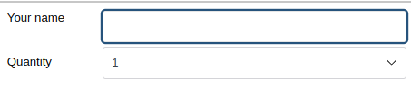
If you just want to use existing widgets, you can put them in your .xet template file:
<?xml version="1.0" encoding="UTF-8"?>
<!DOCTYPE overlay PUBLIC "-//EGroupware GmbH//eTemplate 2.0//EN" "https://www.egroupware.org/etemplate2.0.dtd">
<overlay>
    <template id="myapp.mytemplate">
        <et2-vbox>
            <et2-textbox id="name" label="Your name" class="et2-label-fixed"></et2-textbox>
            <et2-select-number id="quantity" label="Quantity" class="et2-label-fixed"></et2-select-number>
        </et2-vbox>
    </template>
</overlay>
Attributes
Widget behaviour is customised by setting attributes. Different widgets will have different attributes, but some are fairly common across widgets.
ID
// TODO, maybe some notes about content & namespaces.
Disabled vs Readonly vs Hidden
Disabled widgets are fully shown, but in a way that indicates the value cannot be changed. Use disabled to indicate that at some point a user may be able to change the value, but not right now. The widget may be enabled via javascript.
Readonly widgets are shown in a special way that displays a value, but is not interactive. Often we switch to a different component for faster performance, such as a simple label. It is impossible to change the value of a readonly widget, and it cannot be made editable via javascript - the page must be reloaded.
Hidden widgets are not visible, but may be enabled via javascript.
| Normal | ||
| Disabled | ||
| Readonly | ||
| Hidden |
<table>
<tr><td>Normal</td><td><et2-textbox value="Normal textbox" class="et2-label-fixed"></et2-textbox></td><td><et2-button label="Button"></et2-button></td></tr>
<tr><td>Disabled</td><td><et2-textbox disabled value="Disabled textbox" class="et2-label-fixed"></et2-textbox></td><td><et2-button label="Button" disabled></et2-button></td></tr>
<tr><td>Readonly</td><td><et2-textbox_ro value="Readonly textbox" class="et2-label-fixed"></et2-textbox_ro></td><td><et2-button disabled label="Button" readonly></et2-button></td></tr>
<tr><td>Hidden</td><td><et2-textbox hidden>Hidden textbox</et2-textbox></td><td><et2-button label="Hidden" hidden></et2-button></td></tr>
</table>
When the page is submitted normal and hidden widgets will have their values returned and validated. Widgets that are disabled when the page is generated or submitted will not return their value. Readonly widgets do not return a value.
Start disabled, change to enabled
If you want a widget to start disabled and at some point become enabled when some condition is met, there are two ways to achieve this. If you set the disable attribute to true or a truthy value in the template file, it is impossible for a widget to return a value, even if you later enable the widget via javascript. This may be fine for buttons, but for other inputs you want the value.
Method 1: Submit
Submit the etemplate, change the condition from the server so the field is enabled.
This method requires a submit which may be unwanted, but it is impossible for the user to change the value until the widget is enabled by the server. Template
<et2-textbox id="test" disabled="@no_edit"></et2-textbox>
PHP
    ...
    $content['no_edit'] = $content['id'] != ''; // Whatever condition disables the field
    ...
    $this->template->exec(..., $content, ...);
Method 2: Javascript
The field starts enabled in the template, but it is disabled in et2_ready(). This method allows for better UI flow since fields can be enabled directly, but the disabled attribute becomes a UI suggestion instead of a rule enforced by etemplate.
Template:
<et2-textbox id="test"></et2-textbox>
app.ts
et2_ready(et2, name)
{
	et2.getWidgetById("test").disabled = true;
}
enableTestField()
{
	this.et2.getWidgetById("test").disabled = false;
}