Styling
Our overall styling is a combination of our site-wide style (pixelegg / kdots), etemplate2.css and Shoelace styles
Some handy excerpts:
Global CSS variables
:root {
	--primary-background-color: #4177a2;
	--highlight-background-color: rgba(153, 204, 255, .4);

	--label-color: #000000;
	/* For fixed width labels - use class 'et2-label-fixed'*/
	--label-width: 8em;

	--input-border-color: #E6E6E6;
	--input-text-color: #26537C;

	--warning-color: rgba(255, 204, 0, .5);
	--error-color: rgba(204, 0, 51, .5);

	/* Inside a node with a category class like "cat_<category ID>",
      this is defined to the category's color
    */
	--category-color: transparent
}
Use these variables instead of specific colors to make maintenance and customisation easier. In most places, we can use Shoelace’s design tokens as well
<style>
.customStyle {
    background-color: var(--primary-background-color, white);
    border: 1px solid var(--input-border-color);
    color: var(--label-color);

    /* Shoelace gives us many variables as well */
    padding: var(--sl-spacing-medium);
}

.customStyle.warning {
    /* Local override of the label color */
    --label-color: red;

    background-color: var(--warning-color);
    border-width: 2px;
}
</style>

<et2-box class="customStyle">customStyle</et2-box>
<et2-box class="customStyle warning">customStyle + warning</et2-box>
Useful CSS classes
hide
Hides the element using cssdisplay: none
hideme
Hides the element using cssdisplay: none !important;
et2-label-fixed
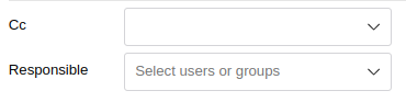
Use on a widget to force its label to have a fixed width. This helps line up labels and widgets into columns
without having to use a grid, which allows them to reflow if needed. Set the CSS variable
--label-width to change how much space the labels get.
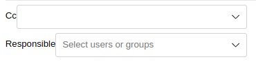
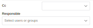
These widgets are in an et2-vbox:
|
|---|
| Without et2-label-fixed class |
|
| Fixed width labels using et2-label-fixed |
|
|
–label-width CSS variable changed for more space Note how ‘Responsible’ widget wraps |
cat_<ID>
Adding a category class sets the category color CSS variable --category-color to that
category’s color. Individual category colors are also available with the
--cat-<ID>-color. Usually used in the nextmatch, this will put the colored category
indicator on the row.
<styles>
    tr {
        border-left: 3px solid var(--category-color);
    }
</styles>
...
<row class="cat_$row_cont[cat_id]">
 // Row contents here
</row>
Directly Customising Widgets
If you need to customise an individual widget further, you can use CSS Parts or Custom Properties to directly override the widget’s internal styling.
Examples
Custom Button Color
<et2-button class="tomato-button">Custom button</et2-button>
<style>
  .tomato-button::part(base) {
    background: var(--sl-color-neutral-0);
    border: solid 1px tomato;
  }

  .tomato-button::part(base):hover {
    background: rgba(255, 99, 71, 0.1);
  }

  .tomato-button::part(base):active {
    background: rgba(255, 99, 71, 0.2);
  }

  .tomato-button::part(base):focus-visible {
    box-shadow: 0 0 0 3px rgba(255, 99, 71, 0.33);
  }

  .tomato-button::part(label) {
    color: tomato;
  }
</style>
Fixed width labels
Here we’ve used the class et2-label-fixed and overridden the standard width of
8em to --label-width: 16em;. Adjust the viewport width to see the widgets reflow
when there’s not enough horizontal space. No grid is used, which allows the reflow from 2 columns to 1
column.
<style>
.fixed-example {
    --label-width: 16em;
}
</style>
<et2-select class="fixed-example et2-label-fixed" label="Select"></et2-select>
<et2-select-number class="fixed-example et2-label-fixed" label="Select number from list"></et2-select-number>
Application styling
See Application Styling for styling at the application level.